Drop down control in iOS

A simple spinner view or a drop down view is quite a common UI component in android. In most cases to have consistent UI across all platforms, it is necessary to replicate this component in iOS as well.iOS does not have a drop down view UI component in-built, instead it supports a picker view.

A drop down control conserves screen space and enables a user to choose one of the options provided, and thus prevents a user from entering erroneous data since they only show legal choices.

Today we will be looking into creating custom controls to mimic the behaviour of drop down control in Xamarin iOS.

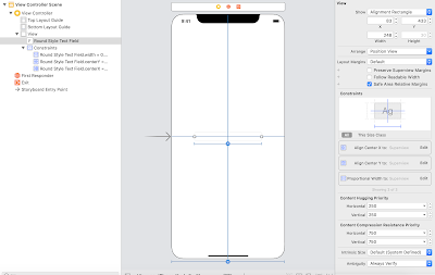
Step 1 :  Add a text in story board and add appropriate constraints to it. Here I have added centre horizontal , centre vertical and width equals 60 % of the superview.


Step 2 : Take an outlet of the textfield


Step 3 : The drop down control is going to be a table view, which is going to be shown and hidden on tap of the text field.

Make the view controller inherit the table view delegate and table view data source  and text field delegate interfaces.

         
 public partial class ViewController : UIViewController ,IUITableViewDataSource,
        IUITableViewDelegate, IUITextFieldDelegate

Step 4 : Create a array of options string that you want to display in the drop down.


 private readonly string[] _optionsList = new string[]
       {
            "Option 1", "Option 2", "Option 3",
            "Option 4", "Option 5"
       };

Step 5 : Implement the data source method to get the number of rows in section.

        [Export("tableView:numberOfRowsInSection:")]
        public nint RowsInSection(UITableView tableView, nint section)
        {
            return _optionsList.Length;
        }


Step 6 :  Implement the data source method to get the cell at  the index path.

       [Export("tableView:cellForRowAtIndexPath:")]
        public UITableViewCell GetCell(UITableView tableView, NSIndexPath indexPath)
        {
            UITableViewCell cell = tableView.DequeueReusableCell("DropDownCell");
            cell.TextLabel.Text = _optionsList[indexPath.Row];
            return cell;
        }


Step 7 : Implement the data source method to get the view for table view footer.

        [Export("tableView:viewForFooterInSection:")]
        public UIView GetViewForFooter(UITableView tableView, nint section)
        {
            UIView footerView = new UIView(new CGRect(0, 0, 0, 0));
            return footerView;
        }


Step 8 : Implement the data source method to get the height for footer.

        [Export("tableView:heightForFooterInSection:")]
        public nfloat GetHeightForFooter(UITableView tableView, nint section)
        {
            return 1;
        }

Step 9 : Declare 2 variables, one drop down Table View and other a UIView to hold the Table view.

        /// <summary>
        ///     The drop down table view.
        /// </summary>
        private UITableView _dropDownTableView;

        /// <summary>
        ///     The drop down view.
        /// </summary>
        private UIView _dropDownView;


Step 10 : Create a drop down table view and set its data source and delegate.

        private void CreateDropDownView(CGRect frameForDropDown)
        {
            _dropDownView = new UIView(frameForDropDown);
            _dropDownTableView = new UITableView(new CGRect(0, 0, frameForDropDown.Width, frameForDropDown.Height));
            _dropDownTableView.RegisterClassForCellReuse(typeof(UITableViewCell), "DropDownCell");
            _dropDownTableView.DataSource = this;
            _dropDownTableView.Delegate = this;
            _dropTextField.Delegate = this;
            _dropDownView.AddSubview(_dropDownTableView);
            AddShadowToDropDown();
}

Step 11 : Create a method to add shadow effect to the drop down view.

        private void AddShadowToDropDown()
        {
            var shadowPath = UIBezierPath.FromRect(_dropDownView.Bounds);
            _dropDownView.Layer.MasksToBounds = false;
            _dropDownView.Layer.ShadowColor = UIColor.Black.CGColor;
            _dropDownView.Layer.ShadowOffset = new CGSize(width: 0, height: 0.5);
            _dropDownView.Layer.ShadowOpacity = 0.2f;
            _dropDownView.Layer.ShadowPath = shadowPath.CGPath;
            _dropDownTableView.ClipsToBounds = true;
        }

Step 12 : Call the above methods in view did load.

        /// <summary>
        ///     View did layout subviews.
        /// </summary>
        public override void ViewDidLoad()
        {
            base.ViewDidLoad();
            CreateDropDownView(new CGRect(countryTextField.Frame.X,countryTextField.Frame.Y,
                countryTextField.Frame.Width,43 * _countryList.Length));
        }

Step 13 : Show the drop down view when text field editing starts. Override ShouldBeginEditing method and return false to disable the keyboard from appearing.

        [Export("textFieldShouldBeginEditing:")]
        public bool ShouldBeginEditing(UITextField textField)
        {
            View.AddSubview(_dropDownView);
            UIApplication.SharedApplication.KeyWindow.BringSubviewToFront(_dropDownTableView);
            return false;
        }

Step 14 :  On Row selection fill the text field with the data selected and dismiss the drop down view.

       [Export("tableView:didSelectRowAtIndexPath:")]
        public void RowSelected(UITableView tableView, NSIndexPath indexPath)
        {
            dropTextField.Text = _optionsList[indexPath.Row];
            _dropDownView.RemoveFromSuperview();           
        }

This is how it is going to look at the end.


I hope you all enjoyed this blog and find it useful. Please feel free to download the source code from this git hub repo.


Vertical slider in Xamarin Forms

A slider offers a way to get continuously values from the user within a given range of values. There are various type of sliders seen across different apps and can be roughly categorised into horizontal sliders , vertical sliders and circular slider based on its appearance. It can have continuous or discrete values based on the purpose of the slider within the application.

In most applications we customise the sliders to get the look and feel we desire. Most common customisations include changing the height, colour and orientation of the slider.

Today we will be looking into creating vertical sliders in xamarin forms application.We will also look at how to increase the height of the slider and colour of the slider.


How to create a vertical slider :

In Xamarin forms to create a vertical slider, you just have to rotate the slider by - 90 degrees.


   <Slider Rotation="-90" Minimum="0" Maximum="80" Value="0" AbsoluteLayout.LayoutBounds=".5,.5,500,90" AbsoluteLayout.LayoutFlags="PositionProportional"/>


This works seamlessly in both android as well as iOS platform.


How to increase the height and change the colour of the slider:

To increase the height  of the slider we need to add custom renderers in both the platforms.

Step 1: Create custom slider class in Xamarin forms.


using System;
using Xamarin.Forms;

namespace VerticalSlider
{
    public class CustomSlider:Slider 
    {
        public CustomSlider()
        {
        }
    }
}


Step 2: Create a custom renderer for the slider control on each platform. i.e; iOS and Android


[assembly: ExportRenderer(typeof(CustomSlider), typeof(CustomSliderRenderer))]
namespace VerticalSlider.iOS
{
    public class CustomSliderRenderer:SliderRenderer
    {
        public CustomSliderRenderer()
        {
        }

        protected override void OnElementChanged(ElementChangedEventArgs<Slider> e)
        {
            SetNativeControl(new MySlideriOS());
            base.OnElementChanged(e);
        }

    }

}


Step 3: Create a custom slider class

public class MySlideriOS : UISlider
    {
        public MySlideriOS()
        {
        }
   }

Step 4: Override Track Rect For Bounds method to change the height of the slider.
In this method you could return the desired rect for the bounds of the slider.


   public class MySlideriOS : UISlider
    {
        public MySlideriOS()
        {
            
        }

        public override CGRect TrackRectForBounds(CGRect forBounds)
        {
            CGRect rect = base.TrackRectForBounds(forBounds);
            return new CGRect(rect.X, rect.Y, rect.Width, 20);
        }
}

Step 5: When changing the height of the slider in iOS, the most common issue faced is that it loses its rounded corners when the thumb reaches the extreme ends.

To overcome this issue we need to provide the minimum and maximum track images to the slider.

If in case, you are using a custom image you can provide the images to the slider. Otherwise you could just create an image out of a colour and provide it to the slider.

Here is the method to create image from a colour.


        public UIImage GetImage(CGRect recttoDraw)
        {
            CGRect rect = recttoDraw;

            CALayer layer = new CALayer();
            layer.Frame = recttoDraw;
            layer.CornerRadius = (System.nfloat)( (0.35 * this.Frame.Height));
            layer.BackgroundColor = UIColor.Red.CGColor;
            UIGraphics.BeginImageContext(layer.Frame.Size);
            layer.RenderInContext(UIGraphics.GetCurrentContext());
            UIImage image = UIGraphics.GetImageFromCurrentImageContext();
            UIGraphics.EndImageContext();
            return image;

        }

Step 6: Change the maximum track image in the custom slider constructor


        public MySlideriOS()
        {
            this.MaximumTrackTintColor = UIColor.Gray;

            UIImage img = GetImage(new CGRect(0, 0, 400, 400));

            this.SetMinTrackImage(img.CreateResizableImage(new UIEdgeInsets(13, 15, 15, 14)), UIControlState.Normal);
            this.SetMinTrackImage(img.CreateResizableImage(new UIEdgeInsets(13, 15, 15, 14)), UIControlState.Selected);

        }

Step 7: In the custom renderer's  overridden  On element changed method replace the control with the custom slider.


 protected override void OnElementChanged(ElementChangedEventArgs<Slider> e)
        {
            SetNativeControl(new MySlideriOS());
            base.OnElementChanged(e);
        }

Here is how the custom slider renderer should look at the end


using System;
using CoreAnimation;
using CoreGraphics;
using UIKit;
using VerticalSlider;
using VerticalSlider.iOS;
using Xamarin.Forms;
using Xamarin.Forms.Platform.iOS;

[assembly: ExportRenderer(typeof(CustomSlider), typeof(CustomSliderRenderer))]
namespace VerticalSlider.iOS
{
    public class CustomSliderRenderer:SliderRenderer
    {
        public CustomSliderRenderer()
        {
        }

        protected override void OnElementChanged(ElementChangedEventArgs<Slider> e)
        {
            SetNativeControl(new MySlideriOS());
            base.OnElementChanged(e);
        }

    }

    public class MySlideriOS : UISlider
    {
        public MySlideriOS()
        {
            this.MaximumTrackTintColor = UIColor.Gray;

            UIImage img = GetImage(new CGRect(0, 0, 400, 400));

            this.SetMinTrackImage(img.CreateResizableImage(new UIEdgeInsets(13, 15, 15, 14)), UIControlState.Normal);
            this.SetMinTrackImage(img.CreateResizableImage(new UIEdgeInsets(13, 15, 15, 14)), UIControlState.Selected);

        }

        public override CGRect TrackRectForBounds(CGRect forBounds)
        {
            CGRect rect = base.TrackRectForBounds(forBounds);
            return new CGRect(rect.X, rect.Y, rect.Width, 20);
        }

        public UIImage GetImage(CGRect recttoDraw)
        {
            CGRect rect = recttoDraw;

            CALayer layer = new CALayer();
            layer.Frame = recttoDraw;
            layer.CornerRadius = (System.nfloat)( (0.35 * this.Frame.Height));
            layer.BackgroundColor = UIColor.Red.CGColor;
            UIGraphics.BeginImageContext(layer.Frame.Size);
            layer.RenderInContext(UIGraphics.GetCurrentContext());
            UIImage image = UIGraphics.GetImageFromCurrentImageContext();
            UIGraphics.EndImageContext();
            return image;

        }
    }
}

Also don't forget to use the custom slider control in the xamarin forms axml file


<local:CustomSlider Rotation="-90" Minimum="0" Maximum="80" Value="0" 
        AbsoluteLayout.LayoutBounds=".5,.5,500,90" AbsoluteLayout.LayoutFlags="PositionProportional"/>


Here is how the slider is going to look at the end.


I hope you enjoyed this blog ...You can find the complete source code here

https://github.com/pooja-kamath/VerticalSlider.git

I would been soon posting  a blog on how to change the height of the slider in android. Stay tuned..

Handling keyboard events in xamarin

Forms are the lynchpin of all mobile interactions. It stands in-between the user and what they are looking for. Forms are just a mean to an end, and the user must be able to complete them without any confusion.

The most important UI element which helps us fill a form is the keyboard and it is really important to provide the user with a keyboard which assists them to fill the form without any hassle. To achieve this it's really essential to handle the keyboard events.

The keyboard enter key provides convenience to the user when filling a form.It can either dismiss the keyboard or move the cursor to the next field which needs to be filled .

In this blogs we will be looking at ways to handle keyboard key events in a Xamarin.Forms application. In the sample we have considered the back button action.

For iOS  :

Step 1 : Create a custom entry class and create a delegate to handle the back button press


public class CustomEntry: Entry
{
    public delegate void BackButtonPressEventHandler(object sender, EventArgs e);

    public event BackButtonPressEventHandler OnBackButton;

    public CustomEntry() { }

    public void OnBackButtonPress() 
    {
        if (OnBackButton!= null)
        {
            OnBackButton(null, null);
        }
    }
}

Step 2 :Within the custom renderer namespace , create a custom text field class.

[assembly: ExportRenderer(typeof(CustomEntry), typeof(CustomEntryRenderer))]
namespace Origination.iOS.Renderers
{
    public class CustomTextField: UITextField
    {
    }
}


Step 3: Within the custom text field, create a event and delegate to handle the delete button click.

public class CustomTextField: UITextField
    {
        // A delegate type for hooking up change notifications.
        public delegate void DeleteBackwardKeyEventHandler(object sender, EventArgs e);

        // An event that clients can use to be notified whenever the
        // elements of the list change.
        public event DeleteBackwardKeyEventHandler OnDeleteBackwardKey;


        public void OnDeleteBackwardKeyPressed()
        {
            if (OnDeleteBackwardKey != null)
            {
                OnDeleteBackwardKey(null, null);
            }
        }

        public override void DeleteBackward()
        {
            base.DeleteBackward();
            OnDeleteBackwardKeyPressed();
        }
}

Step 4 :Within the custom renderer name space, Create custom renderer class.

 public class CustomEntryRenderer: EntryRenderer, IUITextFieldDelegate
 {
 }

Step 5:Within the custom renderer's OnElementChanged method create a text field of the custom text field type.
Step 6: Handle the custom text field delete event by passing it to the custom entry back button event handler.
Step 7: Assign the custom text field object to native control.
protected override void OnElementChanged(ElementChangedEventArgs<Entry> e)
            {
                if (Element == null) 
                {
                    return;
                }

                var entry = (CustomEntry)Element;
                var textField = new CustomTextField();

               textField.EditingChanged += OnEditingChanged;
                textField.OnDeleteBackwardKey += (sender, a) =>
                {
                    entry.OnBackButtonPress();
                };

                SetNativeControl(textField);

                base.OnElementChanged(e);
            }

Step 8 : Add the editing changed handler

IElementController ElementController => Element as IElementController;

 void OnEditingChanged(object sender, EventArgs eventArgs)
        {
            ElementController.SetValueFromRenderer(Entry.TextProperty, Control.Text);
        }

For Android:


In the custom renderer you can handle the key press event and look for the Keycode.Back.In android customising the text fields are not required.

((EditText)this.Control).KeyPress += (object sender, View.KeyEventArgs even) => { 
        even.Handled = false; 
       if (even.Event.Action == KeyEventActions.Down && even.KeyCode == Keycode.Back) 
       { 
          //your logic here even.Handled = true;
        } 

Animated Indexer in Xamarin.Android

Indexer is a quite common UI element in a list view. Its a integral part of contacts list or list of data which can be segregated by alphabets or numbers. It makes app content organised and searchable.
Animating the indexer can add visual cues that notify the user what's going on in the app and they also add polished look to your app, which gives it a higher quality look and feel.


I will be showing you how to implement the above animation in Xamarin.Android, without needing to add any third party libraries.

So let's get started..............


Step 1: In the layout file add a linear layout and a image view, within a frame layout.The linear layout is going to contain all the indexes as text views. The image view is the thumb which would navigate along the user selected index, to highlight the index selected.

 <FrameLayout xmlns:android="http://schemas.android.com/apk/res/android"
    xmlns:app="http://schemas.android.com/apk/res-auto"
    xmlns:tools="http://schemas.android.com/tools"
        android:id="@+id/Frame_layout"
        android:layout_width="match_parent"
        android:layout_height="fill_parent"
        android:background="@android:color/white">
      <LinearLayout
        android:id="@+id/Layout_Cust_Index"
        android:layout_width="match_parent"
        android:layout_height="fill_parent"
        android:layout_alignParentRight="true"
        android:orientation="vertical"
        android:background="@android:color/transparent"
        android:layout_marginTop="15dp"
        android:layout_gravity="right"
        android:gravity="right">
      </LinearLayout>
    <ImageView 
      android:id="@+id/thumb"
      android:layout_width="50dp"
      android:layout_height="50dp"
      android:src="@mipmap/circle"
     android:visibility="gone"
      android:layout_gravity="right"
      android:gravity="right"
      android:paddingRight="-10dp"
      android:paddingTop="-10dp"
      ></ImageView>
  </FrameLayout>


Step 2: In the activity file set the content view and find the thumb image, the linear layout and the frame layout by reference.


             SetContentView(Resource.Layout.Main);

            _layoutIndex = FindViewById<LinearLayout>(Resource.Id.Layout_Cust_Index);
            _frameLayout = FindViewById<FrameLayout>(Resource.Id.Frame_layout);
            _thumbImage = FindViewById<ImageView>(Resource.Id.thumb);

Step 3: Create a array of text views and populate them with the indexes as text views.

            textViewArray = new TextView[26];
            AddIndexToList();

Step 4:  Create the above method "AddIndexToList", Within which we create text views containing characters from 'A' to 'Z' and add them to the linear layout and the text view array for future reference.


 private void AddIndexToList()
        {
            LinearLayout.LayoutParams lparams = new LinearLayout.LayoutParams(100, 0, 1);
            int i = 0;
            textViewArray = new TextView[26];
            for (char c = 'A'; c <= 'Z'; c++)
            {
                TextView btnindex = new TextView(this);
                btnindex.LayoutParameters = lparams;
                btnindex.SetPadding(10, 10, 40, 10);
                btnindex.Gravity = GravityFlags.Center;
                btnindex.TextSize = 12;
                btnindex.SetTextColor(Color.Black);
                btnindex.Text = c.ToString();
                _layoutIndex.AddView(btnindex);
                textViewArray[i] = btnindex;
                i++;
            }
            _layoutIndex.BringToFront();
        }


Step 5: Add the touch event handler to the layout index , to intercept the touch event location and animate according to the user touches.


            _layoutIndex.Touch += TouchesInStrip;


Step 6: Add the method 'TouchesInStrip' to handle the touch down, touch up and touches moved events


private void TouchesInStrip(object sender, View.TouchEventArgs e)
        {
            float x = e.Event.GetY();
            switch (e.Event.Action & MotionEventActions.Mask)
            {
                case MotionEventActions.Down:
                    {
                        for (int i = 0; i < 26; i++)
                        {
                            float y = textViewArray[i].GetY();
                            if (Math.Abs(y - x) <= 10)
                            {
                                indexToAnimate = i;
                                EndAnimation();
                                StartAnimation();
                                AnimateThumb(x);
                                indexToEndAnimate = indexToAnimate;
                            }
                        }
                    }
                    break;

                case MotionEventActions.Move:
                    {
                        x = e.Event.GetY();
                        for (int i = 0; i < 26; i++)
                        {
                            float y = textViewArray[i].GetY();
                            if (Math.Abs(y - x) <= 10)
                            {
                                indexToAnimate = i;
                                EndAnimation();
                                StartAnimation();
                                AnimateThumb(x);
                                indexToEndAnimate = indexToAnimate;
                                break;
                            }
                        }
                    }
                    break;

                case MotionEventActions.Up:
                    {
                        InitializeToStart();
                    }
                    break;
                case MotionEventActions.Cancel:
                    {
                        InitializeToStart();
                    }
                    break;
                case MotionEventActions.Outside:
                    {
                        InitializeToStart();
                    }
                    break;
                default:
                    break;
            }
        }


Step 7: Next step is to add the 'StartAnimation' , 'EndAnimation' and the 'AnimateThumb' Methods.
As the name suggests start animation is to animate the indexes or the characters to form a semicircle along the thumb.
End animation is to move the indexes back to their original position.
Animate thumb is to move the thumb image along the user touch locations.


  private void StartAnimation()
        {

            if (indexToAnimate >= 2)
                AnimateOutward(indexToAnimate - 2, -80f, 400);
            if (indexToAnimate >= 1)
                AnimateOutward(indexToAnimate - 1, -120f, 400);

            AnimateOutward(indexToAnimate, -160f, 400);

            if (indexToAnimate + 1 <= 24)
                AnimateOutward(indexToAnimate + 1, -120f, 400);
            if (indexToAnimate + 2 <= 24)
                AnimateOutward(indexToAnimate + 2, -80f, 400);
        }


To animate it outward we provide the view to animate, the x offset to move outward and the duration of animation.

Here we animate the index at the touch location and two indexes to the top and bottom of the location so that it forms a semi circle


End Animation method animates the x translation to original location i.e; 0


 private void EndAnimation()
        {
            _thumbImage.Visibility = ViewStates.Gone;

            for (int i = 0; i < 26; i++)
            {
                if (i != indexToAnimate && i != indexToAnimate - 1 && i != indexToAnimate - 2 &&
                    i != indexToAnimate + 1 && i != indexToAnimate + 2)
                {
                    AnimateOutward(i, 0f, 200);
                }
            }
        }


Animate  Thumb moves the thumb image to the user touch location


 private void AnimateThumb(float y)
        {
            _thumbImage.Visibility = ViewStates.Visible;
            ObjectAnimator animation = ObjectAnimator.OfFloat(_thumbImage, "translationY", y );
            animation.SetDuration(10);
            animation.Start();
        }


Step 8: Add the 'AnimateOutward' method to animate the view x translate. This method uses the object animator to animate the given view to a given x translate in a given duration of time.


 private void AnimateOutward(int index, float value, int duration)
        {
            ObjectAnimator animation = ObjectAnimator.OfFloat(textViewArray[index], "translationX", value);
            animation.SetDuration(duration);
            animation.Start();
        }


Step 9: Add the final method to animate all the indexes back to position. This method scans through each index and positions them to their original location when the user touches end.


  private void InitializeToStart()
        {
            for (int i = 0; i < 26; i++)
            {
                AnimateOutward(i, 0f, 0);
            }
        }


The animation methods are called based on the touch events and this animates the thumb and the indexes based on the user touches.


I hope you enjoyed this blog..... Please feel to download the sample project from here.

How to add tick marks on sliders in Xamarin Forms


Discrete sliders can use evenly spaced tick marks along the slider track, and the thumb will snap to them. Each tick mark should change the setting in increments that are discernible to the user.


However to achieve this in Xamarin Forms, one would have to add custom renderer in iOS and Android platforms, but here is a simple way of achieving it, without needing to add custom renderer. 


Step 1: Add a slider and a stack layout within  a grid.

<Grid Padding="0,0,0,0" WidthRequest="365">
<StackLayout WidthRequest ="364" x:Name="stack" ></StackLayout>
<Slider x:Name="slider" WidthRequest ="364"/>
</Grid> 
Step 2 : Declare constants 


private readonly int SliderMaxValue = 150;
private readonly int SliderMinValue = 0;
private readonly int SliderStepSize = 5;
private readonly int SliderTickWidth = 2;
private readonly int SliderTickHeight = 2;
Step 3 : Set slider Min and Max values

  slider.Maximum = SliderMaxValue;

  slider.Minimum = SliderMinValue;
Step 4:Set Stack view orientation  based on slider orientation.

           If the slider is horizontal add stack orientation horizontal.
           This stack view will contain the tick marks behind the slider.
   stack.Orientation = StackOrientation.Horizontal;
Step 5: Add the method to get the buffer offset based on thumb size and tick width.

private double GetOffsetFor(int index)
        {
            if (index == 0)
                return 0.0;
            else if (GetSeries().Contains(index))
                return 3.5;
            else
                return 2.5;
        }

        private int[] GetSeries()
        {
            int[] series = new int[13];
            int[] buffer = new[] {0, 0, 1, 1, 1, 2, 2, 1, 2, 3, 3, 3, 3};
            for (int i = 0; i <= 12; i++)
            {
                series[i] = 2 * i + buffer[i];
            }

            return series;
        }
Step 6: Add the ticks to the stack view 

public void AddTickMarksForSlider( StackLayout view)
        {
            int ticksDivider = SliderStepSize;
            int ticks = (int)slider.Maximum / ticksDivider;
          
            view.BackgroundColor = Color.Transparent;
         
            // make a UIImageView with tick for each tick in the slider
            for (int i = 0; i <= ticks; i++)
            {

                Label tick = new Label();
                tick.WidthRequest = SliderTickWidth;
                tick.HeightRequest = SliderTickHeight;

                view.Padding = new Thickness(15,0,14,0);

                tick.Margin = new Thickness(GetOffsetFor(i),0,0,0);

                tick.BackgroundColor =Color.Red;

                view.Children.Add(tick);

            }
        }


Step 7 : Make the slider steps discrete.

slider.ValueChanged += (sender, e) =>
            {
                double StepValue = SliderStepSize;

                var newStep = Math.Round(e.NewValue / StepValue);

                slider.Value = newStep * StepValue;
            };
This is how its going to look at the end.


I hope you enjoyed this blog... Please feel free to download the sample project from here

How to Re-Use views in Xamarin.iOS

When it comes to reusing views, it involved creating a XIB file, extending the UIView class and overriding multiple initializers to load the NIB file programmatically. But with the introduction of container views and storyboard references , this process has been simplified and involves no coding.


The commencement of storyboard references enabled the developer to have multiple smaller storyboards. Which overcame the biggest drawback of using a storyboard file,  which was complexity.

As most of the projects earlier contained only one storyboard, it became cumbersome for a large project.
Single storyboard made it impossible for a large team to work on the same storyboard without stepping on each others toes.

In this blog post, I’ll walk you through the steps on how to create slide out hamburger menu.


Getting Started 

Reusing Storyboards:


 Step 1: Create a single view application in Visual Studio


 Step 2: Open the Main.storyboard file in Xcode.


Step 3: Add another view controller to the storyboard by dragging and dropping it from the menu.


Step 4:Create a customer Registration form by adding 3 Labels and 3 Text fields .
This would enable the user to enter Name, Password and Confirm the Password.


Step5: Embed them in a stack view.


Step 6 : Add constraints to stack view to make them horizontally and vertically center and set the text fields width constraint to 100.


Step 7: Increase the stack view spacing to 20 .


Step 8: Add a button to finish the registration.


Step 9 : Add another button to first view controller to navigate to the registration form view controller


Step 10: Add another View controller to Show success or error message through a label and navigate to it through the register button in registration view controller.

Step 11: Select the registration View controller and the Success message view controller and  Refactor to storyboard.


Step 12 : Name the new storyboard file


Step 13: Now you have 2 separate storyboard files interlinked to each other.If anywhere else in the flow you would need to show the user the registration flow , all you have to do link it to the story board reference.


Reusing Views :


Step 1:Add a container view to the view controller.


Step 2: Customise the container view's  view controller according to your needs.


Step 3: To reuse the same view controller you can drag a new container view.


Step 4 : Delete the new container view's view controller.


Step 5: Link the new container view to the old customised view controller using embed segue.


Here is how the project looks at the end.


I hope you enjoyed reading this blog ,please feel free to download the project file here.

Popular Posts